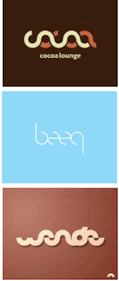
Since I've been talking about branding I thought I'd have a look at logo design. Personally I'm a big believer in designing logos that can stand alone from any text and still be clearly identifiable as your organisation. Think Nike, Apple, Microsoft Windows and the original Adidas logos. Anyway, I recently came across a cool post on trends in visual design for logos.
So if you're thinking of starting a new enterprise or are in the process of updating your brand, here are some thoughts below based on a post from logoorange.
- 3D: the organic rather than blocky sort. Be careful though. Here's the Microsoft Silverlight example. Visually nice - yes. Memorable - no!

- Waves: Apparently the swoosh is dead. It's all about waves with fades these days.

- "Web 2.0": Think rounded corners and glassy

- Transparency: Subtle effects are in

- Minimal "Underground" Typography: None of these still exist so no idea what that says about this form of logo!

- Rainbow Color Scales: Unfortunately everytime I see anything like this I think 'Polaroid'! Other examples are SpaceTime and ElasticDigital. Their logos look really similar though.

- Sci-Fi Fonts: You can end up looking very tech geek or "video-gamey", so be careful.

- Leaves: Green is big right now. Leaves help you ride the eco wave and can give your brand that fresh peaceful look.

- The "Ugly" 80's: What can you say about this, except that it's a risky strategy unless you're of the belief that even bad publicity is still good!

- The New Crest: Medieval symbolism and urban culture graphic elements can be very cool if done well. If not, they just look complicated and impossible to identify the company within.


